Echo Fitness Studio
Echo Fitness Studio was conceived as more than just a gym: it’s a place where fitness meets identity — strength, lifestyle, and community come together.
Service (s)
Visual identity design
Year
2024

the aim.
The brand aimed to position itself as a modern, energetic, yet approachable fitness destination — one that speaks to people who value discipline but also care about style, clarity, and a sense of belonging.
To achieve this, the studio needed a brand identity that would communicate energy, confidence, and modern fitness culture — while staying professional, clean, and versatile across physical (signage, posters, apparel) and digital touchpoints (website, social, membership cards).


Design Strategy & Visual Identity Solution
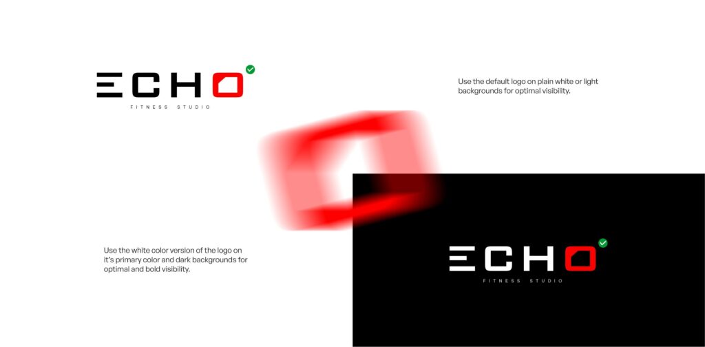
The logo and wordmark were crafted to be straightforward and memorable — unapologetically direct, reflecting the no-frills, results-oriented attitude of the studio. This approach follows a similar logic to those used in successful fitness-identity case studies where a simple logotype outperforms busy emblem-style logos in versatility and longevity.

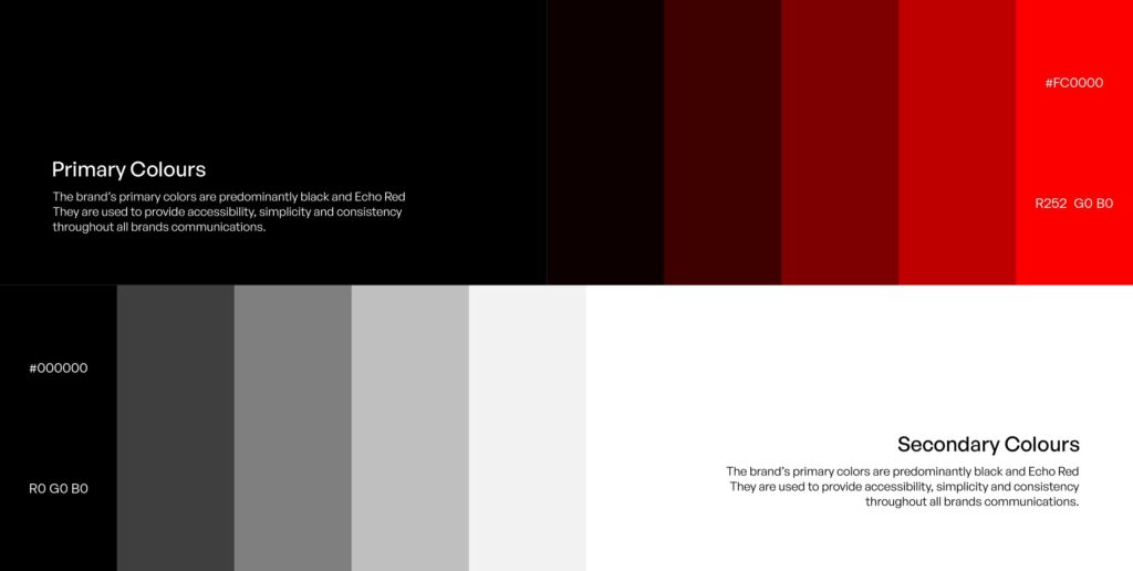
A strong color palette and typography system were defined: neutral tones to provide a professional foundation, paired with striking accent or highlight colors (when needed) to evoke energy and action. This helps the brand remain flexible — whether for print posters, social media, apparel, or signage — without losing consistency.
Layout rules, spacing, and clean composition were emphasized so all brand touchpoints — whether a site mockup, membership card, or gym poster — feel part of the same family. This structured, consistent visual system ensures brand recognition and reinforces trust over time. Such consistency across channels is a hallmark of strong fitness branding.


The logo and wordmark were designed to be clean and timeless — no gimmicks, just clarity. A neutral color palette with refined accents was selected to give the brand a versatile but distinctive look — easy to adapt to many project types and client needs. Typography, spacing, and layout rules were established to ensure consistency across all brand outputs. The identity was built not only for digital use (web, portfolio, social) but also for print — business cards, stationery — underpinning the agency’s legitimacy.


Outcome & Brand Value
Thanks to this cohesive identity, Echo Fitness Studio presents as confident, modern, and reliable. The visual consistency across media ensures that whether someone sees a social post, a business card, or a gym wall, they immediately recognize the brand. This recognition helps build trust, conveys quality, and communicates that this is a serious fitness studio with a clear identity and purpose — not just a generic gym.
More than just “looking good,” the identity design becomes part of the studio’s promise: discipline, clarity, and progress. It helps Echo stand out in a saturated fitness market, attracts clients who value both results and aesthetics, and creates a foundation the brand can confidently build upon — for physical presence, digital presence, merchandise, and more.


how satisfied was Echo Fitness?
Brandon Young
CEO ECHO FITNESS – USA
